A world Unknown
The Importance of..
Last week got off to an brilliant start with the focus on key fundamentals in art practice. Iain Talked us through the importance of composition and the many variants in which it comes, such as:
- The Rule of Thirds
- The Golden Ratio
- Leading Lines
- Implied Forms - The Circle
- Implied Forms - The Radii
- Implied Forms - The Cross
- Implied Forms - "L"
- Implied Forms - Iconic
- Camera Tilt (to add a dynamic feel)
The quick run down of the key to creating a successful image if the first i have received from formal education. I made sure to draw out basic examples of each in my sketchbook for later referencing, this is so incredibly important for me to understand, as it wont matter how good of a draftsman i become my work will always look wrong without the correct perspective and composition to complement it.
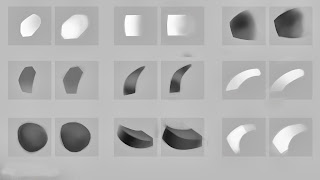
After the quick run down of the fundamentals we quickly moved onto the basics of PS, this to me was both new and old. I have never been shown anything in PS before as i taught myself and gleamed pieces off the internet over the last year or two, so one of the techniques such as "Masking" was entirely new to me but has now become the core of my working process.
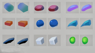
As the focus of this session was painting at speed i aimed for recreating each image (assending in difficulty)
as quick and as accurately as i could. This lead to me at first becoming slightly irritated as i like to spend time on just about any piece of work i do, but i forced myself to continue onto the next one. On a few of the images i couldn't help but spend more time on them, so i had to continually check myself as this is CRUCIAL for me to become a successful CA. Speed, Clarity and Strong, these are the new words i have plastered into the front of my sketch book for me to memorize and fulfill every time i do a silhouette, a thumbnail or painting. I HAVE to get across quickly the whole message of the image so from a glance anyone can understand it and especially for the silhouettes for it to be memorable and different!
Colour Theory
This was a subject i was most interested to learn about, the brilliance of colour! Yet again this was a case of not being shown anything other than a sheet of paper with a colour wheel on at GCSE (no one even attempted to talk about it in my Illustration Degree). So Iain walked us through subjects such as Value and tone, Tint and Shade, Primary, Secondary and Tertiary colours. This was so immensely useful to me and im really grateful to Iain because now i can see when i look at my old work the lack of knowledge i had of colour is blatantly obvious. I now always have a colour wheel up using the inspiration from "Triad Colours" while i work.
Conclusion
This was the day of the greatest importance to me as it covered everything i need to know to create and become a successful CA. I cant lie and say that i fully understood and absorbed everything but i will say that i will try my damnedest to understand and use all of the compositions at my disposal aswell as extensive use and study of colour. As Iain said some artist dedicate their lives to the understanding and experimentation of colour and now i hope by Zeus's great beard that i will soon have a correctly functioning use of it.
Some examples of my work over this day:
The Dawning of the Second Day!
The second day was dedicated to how to create colour thumbnails using existing images for colour references and mood. I found this at first to be quite challenging as i was just getting us to using colour it compliments but i gave it my best shot, i felt this was very similar to the game we had on the first day of drawing an Apple 16 diffrent ways. I feel there is some that work nicley as the colour and the composition work well together, here is what i did in the first part of the day:
I feel a real pull to the Mermaid image (No 3) as the Suggested circles draw the viewer in, I tried to use a mix of the Golden Ratio and The Rule of Thirds. The bottom right hand corner of the thumb does feel a little exposed and out there, the use of coral in the foreground might help frame the image better.
The shoal of sharks was an attempt of getting the mood of the light and fun bay and flipping it on its head, but not leaving the lighter colour pallet. i tried to do this by having the darker blues coming from the depths up to the lighter sun soaked waves with the highlights of light beams coming through the water. For this image i tried to just use The Rule of Thirds as for a simple image i thought this would work best. I added the two other Hammer heads to give a sense of distance and depth to the basic image .
Most of my time was spent on working out ideas to paint which was the most frustrating thing for me so i quickly adapted to selecting a colour and painting until my eye see's a shape that i like then i went from there. I think this was the least useful thing i could have done as planning is so important in making an image.
In the last part of the day we focused on doing quick colour studies using the "Grey Box" method. This was really fun for me as i wasnt allowed to use the colour dropper and had to rely on my eye to make sense of the colour and for me to pick the out using the HSB sliders in PS. Iain told me that i have to do a few of these every day to increase my off hand knowlage of colour and how well it works in other peoples work. So here are two examples of what iv been doing, one is from the other day (30th) and the other from the thumbnail class.
So ill finish here as im tired and i have class in 9 hours!


